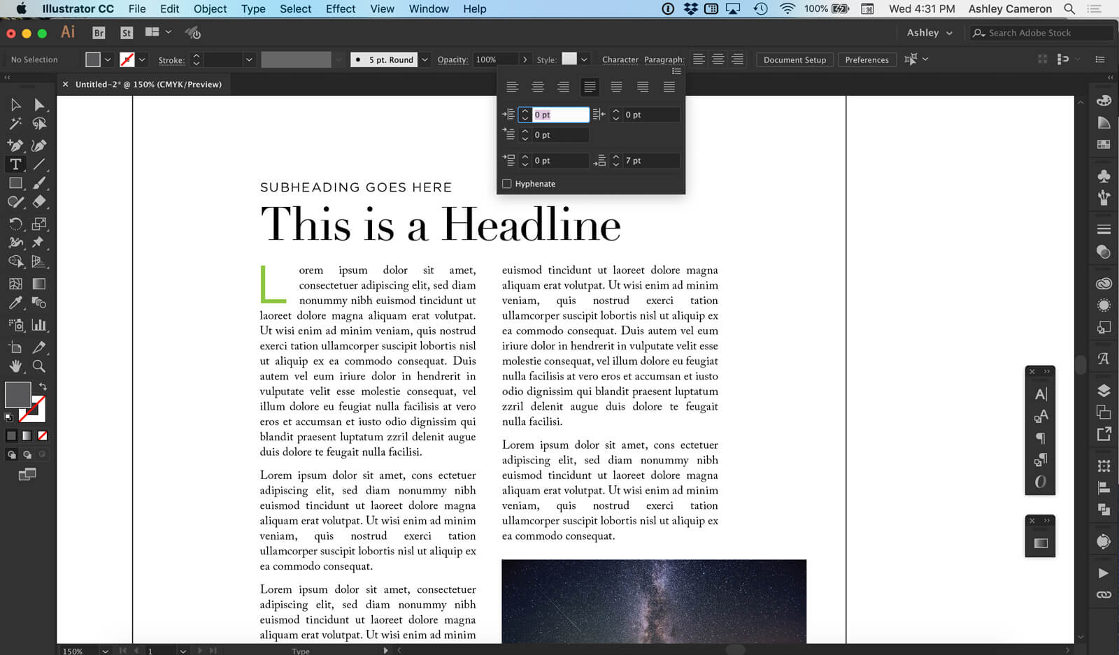
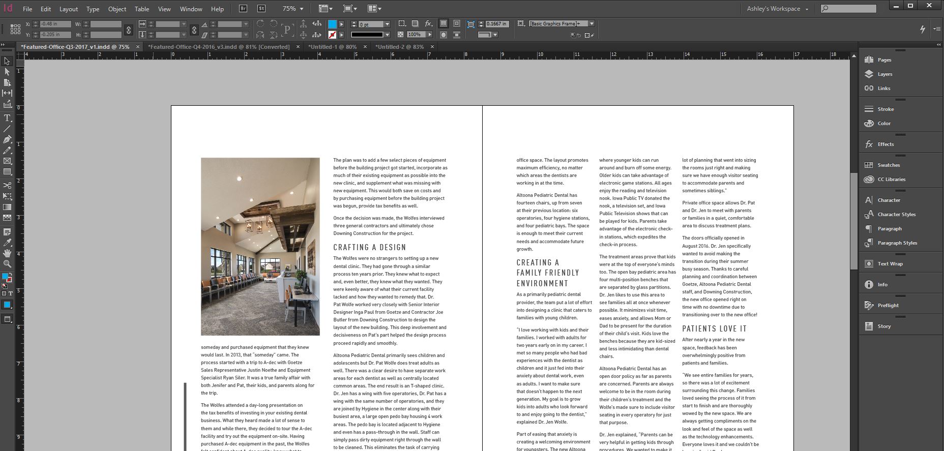
This brief video is packed with design tips to improve your layout and text readability.
Table of Contents
0:48 Body copy font size
1:09 Space after paragraph
1:25 Line height / leading (1.3-1.5 of font size)
1:55 Optical kerning (space between letters)
2:15 Page margins – breathing room
2:30 Alignment/centering
2:38 Line length (column width)
2:48 Create columns
3:09 Paragraph justification
3:30 Fix orphans & widows
4:00 Headline (scale larger for hierarchy)
4:33 Subheading
6:40 Drop cap
8:10 Text wrap on letter/object
10:24 Text wrap on image and caption
11:45 Don’t stretch type; scale proportionately
12:16 Use a limited number of fonts – too many can be chaotic
13:06 Single space between sentences
13:56 Using scripts as headlines – don’t use all caps
14:50 Change type case – e.g. UPPERCASE, Title Case…


