Client
eSystem Training Solutions
History
eSystem Training Solutions is a company built with the tower climber or rigger in mind. Their online curriculum is written and developed by subject matter experts with several decades of Telecommunications Construction experience to offer the most complete, easy to manage, and effective training options for customers. Their objective is to make safety training easily accessible online to anyone who needs it.
Design Inspiration
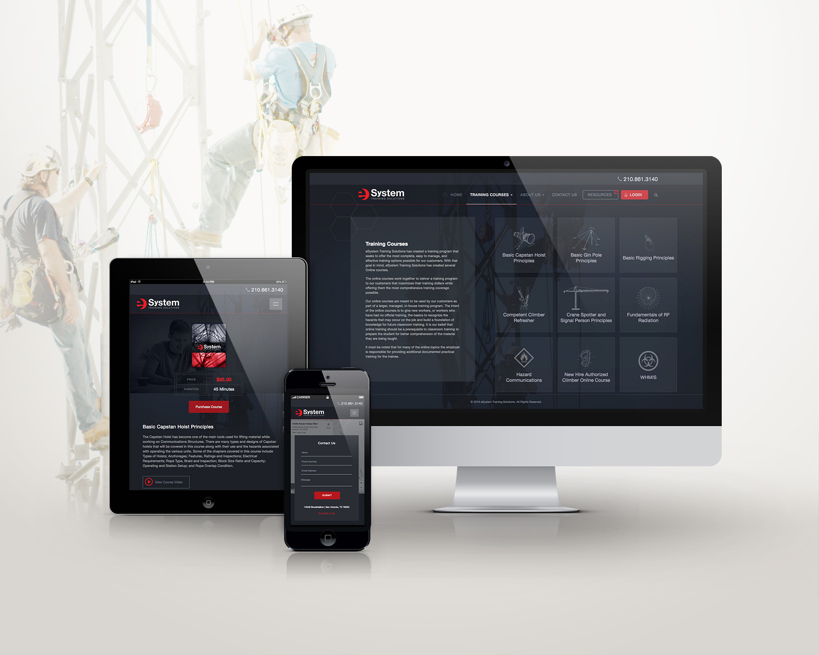
eSystem Training Solutions had a large library of photography with which to design their brochure website. The logo Scott designed primarily used the color red and either black or white text depending on usage. Red can be overpowering, so in broadening the range of colors, I wanted keep a sense of neutrality and seriousness. I chose variations of a dark, subtle blue-gray and blue-black, scaling select photos fullscreen and taking down the opacity to create texture and interest in the background without losing contrast with the copy. On the training courses page, I graphically represented each course to include more interesting visual elements.
Logo Designer: Scott Shaner
Lead Designer & Developer: Ashley Cameron


