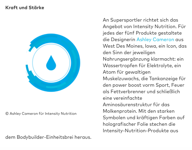
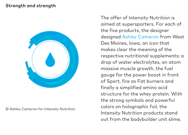
The graphic icons I designed for Intensity Nutrition’s supplement packaging rebrand, earlier this year while at Aradius Group, recently gained recognition in PAGE Magazine’s December issue entitled ICONS (page 025). I was most certainly surprised when a writer from Germany contacted me for a brief interview and requested assets for the publication. Online version here.
Icons in the Corporate and UX Design
They are everywhere: Icons, pictograms, emoji – but by no means always fulfill their function. Where are the opportunities where the limits in the use of icons? And what must be considered in their design?