A Comprehensive Guide for
Mastering the
Art of Typography
Instantly improve your designs and layouts
Typography plays a crucial role in design, influencing how users perceive and interact with content. Whether you’re a seasoned designer or just starting, here are some essential tips to elevate your typography.
Typo
graphy
01
Use one font
Advantages
Consistency
Readability
Brand Recognition
Simplicity
Timelessness
Ease of Use
Typeface vs Font
Typeface
A typeface is the overall design of a set of characters. It encompasses the visual appearance, style, and artistic elements of the characters, including their shapes, weights, and proportions.
Examples include Helvetica, Times New Roman, and Arial. Each of these has a distinct design that sets it apart from others.
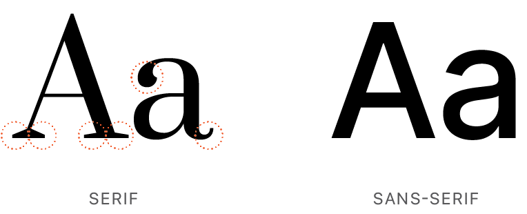
Font
A font refers to a specific style, size, and weight of a typeface. It is a complete set of characters with a particular size and weight within a typeface.
For instance, Arial Bold 12pt is a font within the Arial typeface. It specifies a bold style, a size of 12 points, and is part of the overall Arial typeface.
02
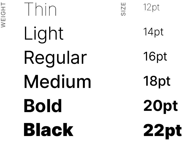
Skip A Weight
Using different font weights strategically is a powerful way to create contrast and establish a clear hierarchy. Try bold for the headline and light for the body copy. This distinction aids in quickly scanning and understanding the content.
Use bolder font weights for primary information that you want to emphasize.
Regular weight is often most legible for paragraphs of body copy.
Lighter weights can be reserved for secondary or supporting details.
03

Justify Left
Left justification is the most common and follows the natural reading order in languages that read from left to right. The text is aligned to the left margin and the right margin is ragged.
Text Alignment
Text alignment refers to how text is positioned horizontally on a page.
Shape
Strive to create a ragged edge that avoids long, uninterrupted straight lines. This can be achieved by introducing subtle variations in word spacing and line breaks. Use hyphens judiciously to break longer words and create more balanced lines. Avoid excessive hyphenation, as it can disrupt the flow and readability.
Ragged edge
Forcing justified type, or full justification, can lead to the creation of rivers—uneven and distracting gaps or white spaces running through a block of text. These gaps disrupt the natural flow of the text. In many cases, left-aligned or ragged-right text may provide a more readable and visually pleasing.
Justified
Hyphenation
Hyphenation is the process of dividing a word into two or more parts and connecting them with a hyphen (-) in order to prevent the word from breaking at the end of a line. This is typically done to ensure that text is evenly spaced and to maintain a consistent appearance, especially in printed materials. Try to avoid using many.

This body copy text is fully justified. All its lines are the same length and visually form a column.
04
Line height, also known as leading, refers to the vertical space between lines of text. Striking the right balance is essential; too little line height can result in cramped, hard-to-read text, while excessive line height may lead to disjointed and scattered content. The optimal line height provides a comfortable rhythm for reading and harmonious interplay between words and white space. Thoughtful consideration of line height is a hallmark of well-crafted typography, ensuring that every word is presented with clarity and elegance.
12pt / 18pt
While body copy benefits from a moderate and balanced line height to ensure readability and a pleasant reading flow, headings often demand a more dynamic approach. A slightly tighter line height for headings can create a visual hierarchy, making the titles stand out with a sense of prominence and emphasis without sacrificing overall coherence.
12pt / 26pt
Mind The Spacing
Leading/Line-height
The space between lines of type.
The relationship between font size and line height is ~1.15 to 1.5 times (x) the font size. For example: The line height for 12pt font would be 18pt.
Tracking
The space between characters.
Sentence, camel case, and lowercase
t e x t a r e h a r d e r t o r e a d w i t h
i n c r e a s e d t r a c k i n g .

Kerning
The space specifically between 2 letters/characters.
Line Length
The length of a line of text plays a pivotal role in determining how effortlessly readers can absorb information. The golden rule often suggests that a line length of around 50-75 characters is ideal for readability. Traditional line length for print-based text falls between 45 and 75 characters per line (cpl), though the ideal is 66 cpl (including letters and spaces).

Narrower columns read more quickly. A sidebar is often narrower than body copy. Avoid having a single word on the last line of a paragraph, otherwise known as a
widow.
Paragraph Spacing
The space between paragraphs, known as paragraph spacing or leading provide readers with a clear visual cue for transitions. Too little spacing can make the text appear dense and overwhelming, while excessive spacing may lead to disjointed and disconnected content. Spacing equivalent to 1.5 times the font size is typically the right balance.
Prevent a new page or column from beginning with the final word or line of a previous paragraph to maintain visual continuity and readability of text.
Embrace White Space
Allow for ample white space to prevent visual clutter. White space enhances focus and draws attention to key elements.
. A
Use a single space after punctuation in a sentence.
05
2X4X
Optimal Point Sizes
Doubling the point size of headings in relation to body text establishes a clear visual hierarchy and noticeable contrast between headings and body text. For example 12 pt. body copy, use 24 pt. for the headline.
The specific design context, typeface characteristics, and overall aesthetic can influence the choice of font sizes. When doubling is unfitting, aim for a minimum 2-point size difference between headings and body text to distinguish levels of information.
Minimum Sizes
9-12 pt
For most body text in print, a minimum 9 pt. is recommended.
Web
14-16 px
A minimum of 16 pixels for body text ensures readability on various devices and screen sizes.
06
Limit Font Varieties
Classic and versatile fonts have a timeless quality. By carefully selecting 1-2 fonts, you can create cohesive designs that age well and remain relevant over time.
Avoid using two fonts of the same classification. For instance, do not use two sans serif, serif, or script faces together.
Classic Fonts
These typefaces have stood the test of time and remain popular for their versatility and readability.*
Serif
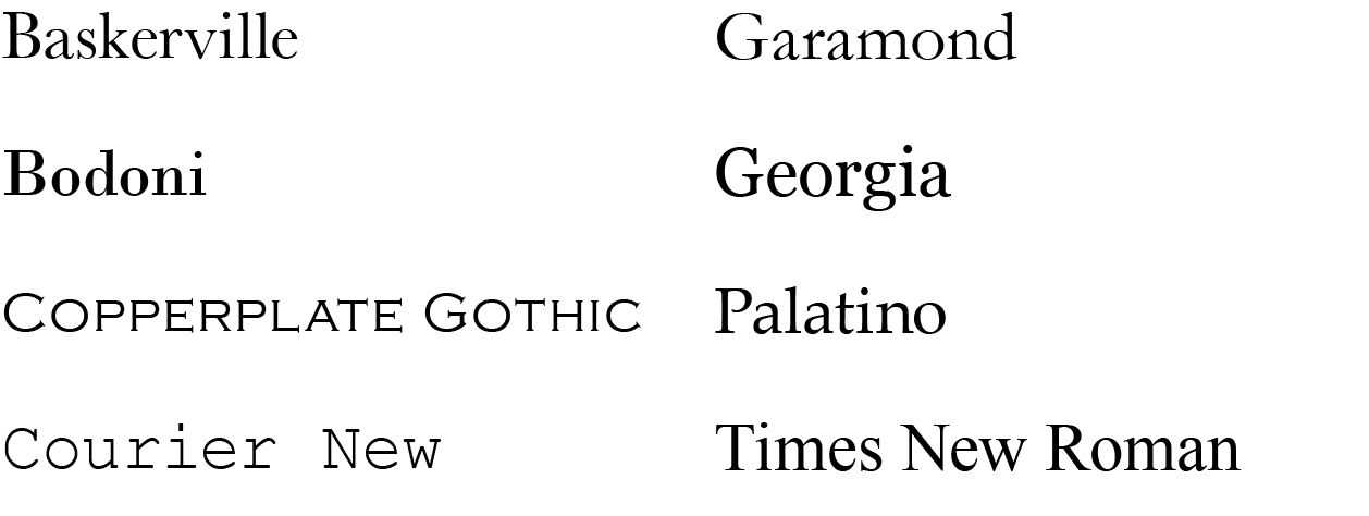
Sans serif
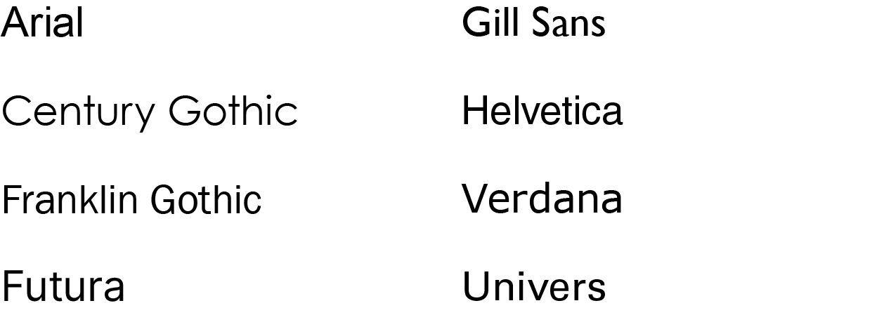
*Copperplate Gothic & Courier should really only be used in special cases.
Fonts to Avoid
These system fonts may come installed with your computer, but *honestly* they’re inappropriate most of the time.
Design Ruiners
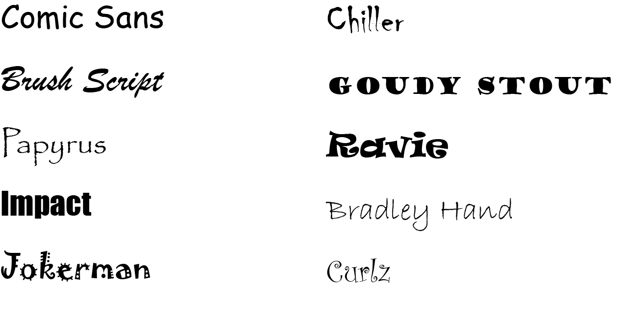
What Makes A Font Bad?
This topic is subjective, but here’s a short list of common factors used to determine a font is bad.
Hard-to-read
Impractical
Unclear
Overused
Not-optimized
Inappropriate*
*Mismatching the typeface personality with message personality can be a major problem.
07
Fonts Have Personalities
Fonts convey different personalities based on their design characteristics. People have an innate sense of relationships between fonts paired with a description. Specific emotional responses are linked to the forms of letters.
Serif Fonts
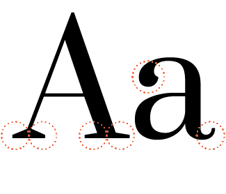
These typefaces are generally observed as traditional, elegant/sophisticated, reliable, authoritative, focused, organized, and calm.
Sans Serif Fonts
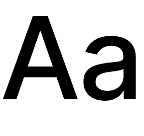
These typefaces are modern, minimalist, straightforward/direct, innovative, progressive, and can have a friendly and approachable personality.
Script Fonts
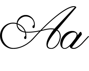
Script fonts elicit a range of personalities, dependent on the nuances of the characters including elegance, romance, femininity, vintage/nostalgia, playfulness, casual, handmade, and expressive.
08
Exploration,Organization,
& Inspiration
Keep the guidelines above as a touchstone as you explore typography. Organizing and maintaining your fonts in collections will save time comparing fonts when determining the aesthetic of the design and aligning the typography with the message to be communicated.

Explore & Experiment
Use a tool such as Google Fonts (free) to preview typefaces and fonts, compare sizes of headings to body copy, and stay up-to-date on trending and popular fonts.

Organize & Manage
Use a font manager such as FontBase (free) to organize font collections, activate fonts, experiment, and preview styles.

Typography Inspiration
Here are some of my favorite typography pins from on the web.
Remember, effective typography goes beyond aesthetics; it's a powerful tool for conveying information and enhancing user experience. By implementing these tips, you'll be well on your way to creating visually stunning and impactful designs.
Ready to Transform Your Ideas into a Valuable Online Presence?
Your website is a powerful tool and resource designed to grow your business with purpose, share valuable information and engage customers. Let's explore the possibilities!

