Style Guide Benefits
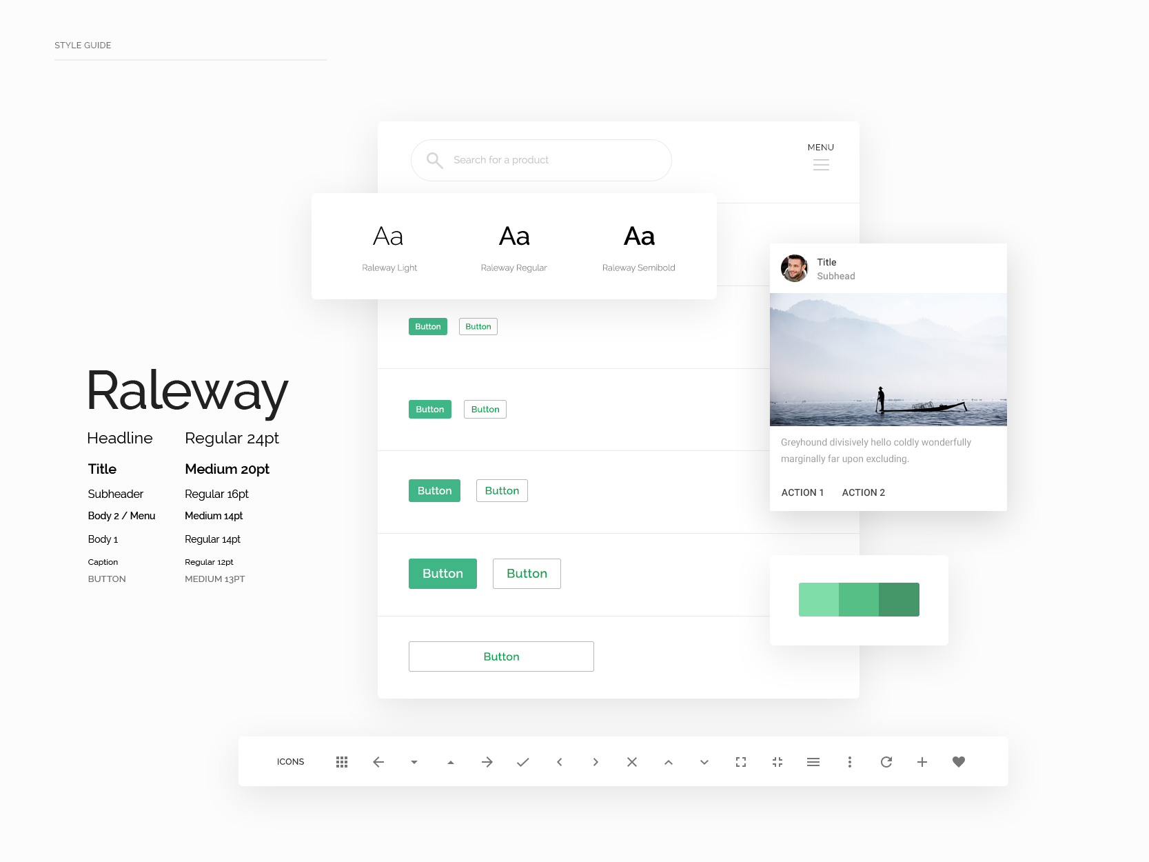
New brands, legacy brands, individuals, and teams of all sizes can all benefit from brand and web style guides. After all, the key factor is ensuring that a brand and its messaging are displayed consistently across various platforms (website, social media, email marketing, web banners, etc). Style guides can begin with the basics (typography, buttons, links, & colors) and expand into complex design systems and even a resource library. The level of detail in a guide facilitates future development as team members may change over time.
What does a style guide include?
Brand Goals/Objectives
Most importantly, a guide should align with the vision, mission, and values of a company. Understand who the brand is apart from personal opinions or subjective feelings. The guide should be a visual and sometimes literal [textual] reference of the brand story and emotional rapport conveyed to its audience.
Organization of assets is also key. If you’re a designer, create a style guide maintaining layers in either Photoshop or Illustrator. Make sure to package any required fonts and save swatches as an importable library or swatch panel for easy access and sharing.
If you’re a coder, it is even better to create an HTML document with the assets coded for ease of copying styles.
Typography
Identify headlines (h1, h2, h3, h4, h5, h6), as many as are most used and necessary, their font sizes, weights, color, and any transformations (e.g. uppercase), letter-spacing, and margins. Include body copy, ordered and unordered lists, inline links, and blockquotes/captions.
Color Palette
Establish a set of recognizable primary, secondary, and any tertiary or accent colors. Also include neutrals and any examples that are helpful in understanding when to use (or when not to use) a particular color. One to two colors may also be used for calls to action or alerts.
Define when prominent colors may be used for headers and footers.
Buttons
Buttons are often a call-to-action color. They sometimes include an icon and often involve hover and/or transition states.
Imagery
Think about how images are displayed – are there rounded corners or frames? How does the tone speak to the brand? If you think of Instagram, there are various filters and levels of contrast and saturation. Does the brand use black and white photography? Desaturated? A particular hue or level of contrast?
Iconography
Icons can give context to content and denote functionality on your site; there’s an array of icon styles (e.g. line, sketch, flat, 3D). Choose or create a set that’s appropriate for the industry and compliments typography and other design elements.
Forms
Form fields allow users to interact with and send data through a website. In your style guide, define backgrounds, borders, border radii, active, focus, and hover states when applicable, and styled messages (e.g. This field is required. Your email was sent successfully.)
Space
Define padding, margins, and space between lines of text, images, buttons, and form elements. Include particular sections and layouts that show hierarchy, the flow of content, and positioning. Space may be visualized using grids and/or columns.
Voice
Thinking back to the brand identity, include textual content that carries the “voice” of content and clarifies the level of formality, the point of view, and the style of communication that gives personality to the brand. Here’s an example of MailChimp’s Voice & Tone and another guide to better understand how to define a brand voice.
Dos & Don’ts
Dos and don’ts, as you would find in a brand guide, can also be helpful in a web style guide to share appropriate and incorrect usage or element pairings.
Additional Thoughts
If this list seems overwhelming, fear not – items 1-4 will give you a jumpstart at defining an effective style guide. There are all sorts of creative examples floating around the web if you want to spend more time on yours. The most important factors are that the guide reflects the brand, is usable for you and others, boosts your workflow, and brings confidence through a better understanding of the brand design.


