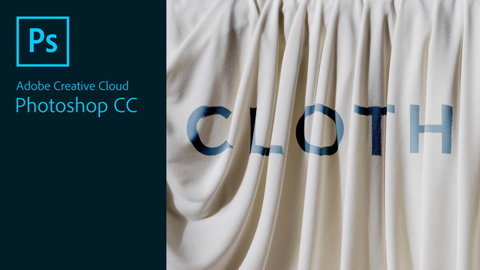
Let’s look at how to create a realistic mock-up using a displacement map.
Create A Displacement Map
- First create a displacement map by going to Layer Styles, Hue/Saturation.
- Decrease the saturation all way down, so it’s black and white.
- Save the file as your displacement filename (.psd)
Add Logo/Graphic/Text
- Open your original document/image.
- Place your graphic/text. If using text, convert the text to a smart object.
Apply Displacement Map
- With the graphic layer selected, go to Filter > Distort > Displace
- Leave the original settings (click ok, since we won’t be resizing after placing)
Adjust Blend Mode to Emulate Realism
- Change the blend mode on the layer now, or we can make this really editable by bringing the fill down to zero. If you double click on your graphic layer (in the blank space), it will bring up layer styles.
- Add a color overlay and adjust the blend mode to give it an effect that looks most realistic.
- If you notice pixelation or fuzziness, go back to the displacement map, click on the background and go to Filter > Blur > Gaussian Blur. Depending on what the image resolution, sometimes 1 pixel radius looks good, otherwise, you may need more. In this case, I’m using a two pixel blur. We need to re-add the displacement, so you can click on smart filter and drag it to the trash. Go back to Filter > Distort > Displace to update the displacement map.
The displacement map uses the black and white values of the toalter your image.
Now that we have a mock-up created, you can double click on the actual thumbnail of the graphic layer to enter the Smart Object and change the image or add new layers to update the graphic overlaying the background.


