CLIENT
AuroMedics (now Eugia US)
HISTORY
AuroMedics strives to make buying generic injectables an experience customers look forward to. They are vertically integrated, developing the majority of our products in-house, and as a result, can maximize efficiency and provide a consistent supply of high-quality products at reasonable prices. AuroMedics serves Health System Customers, GPOs, and Trade Partners.
Partnership
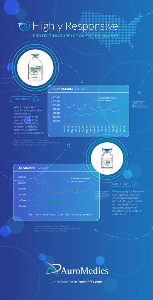
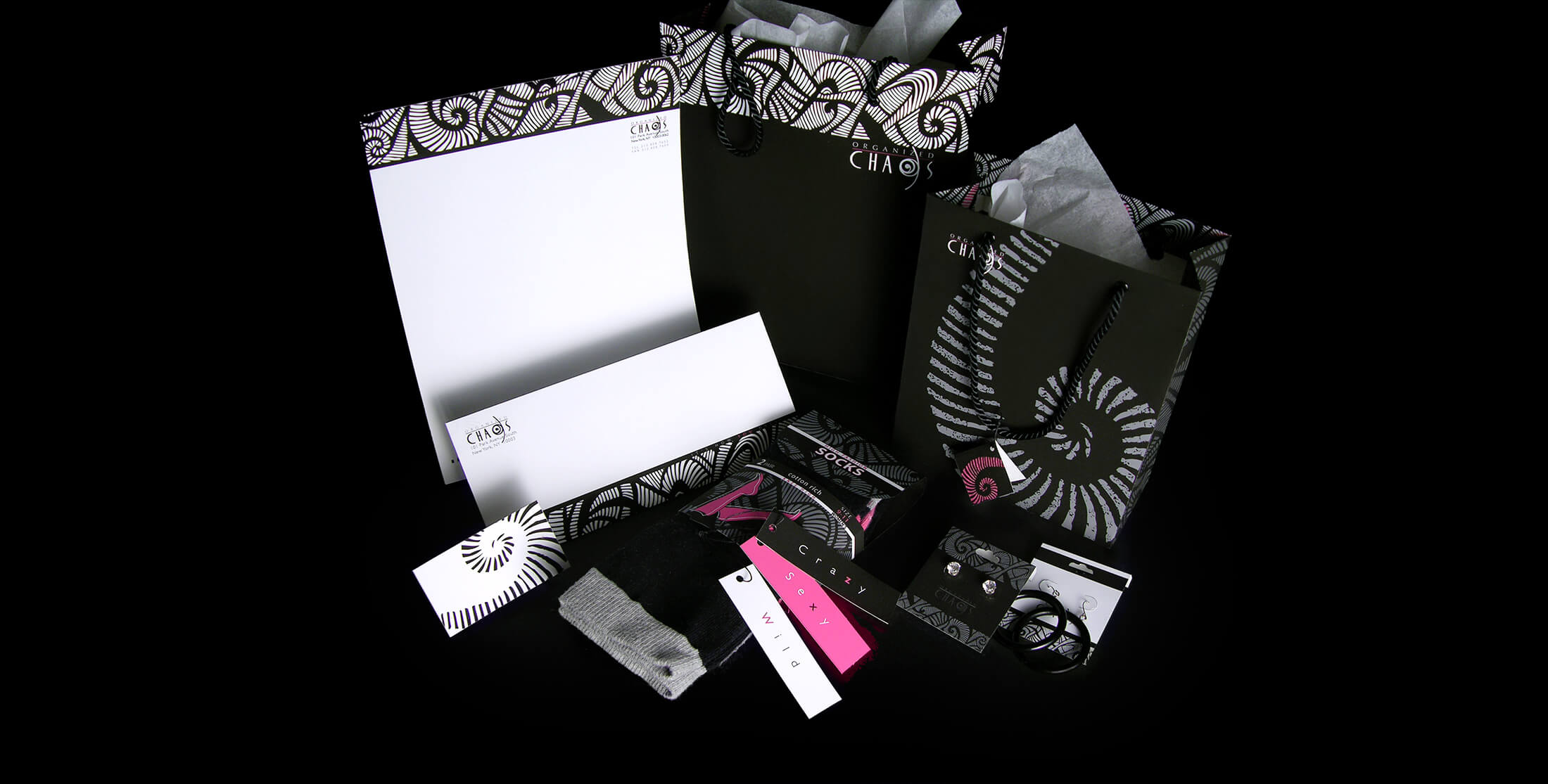
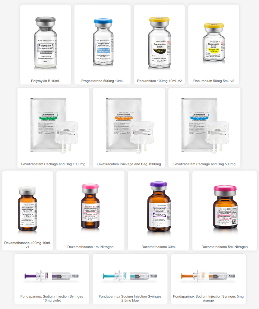
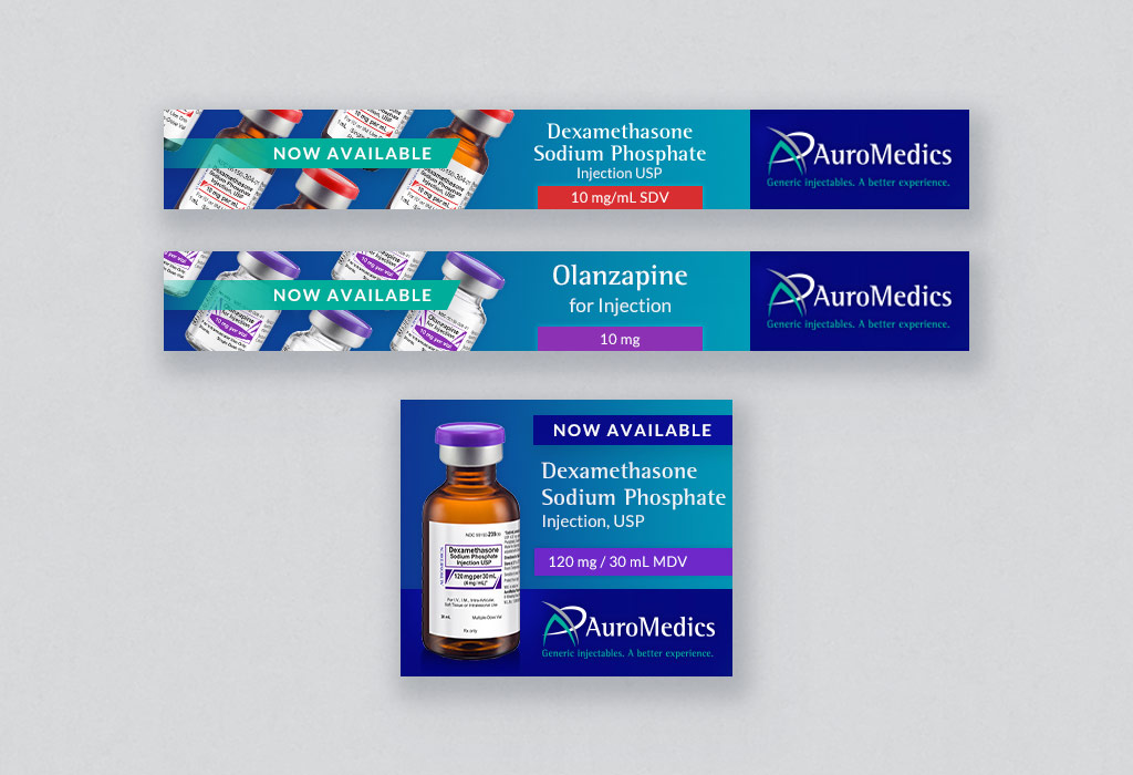
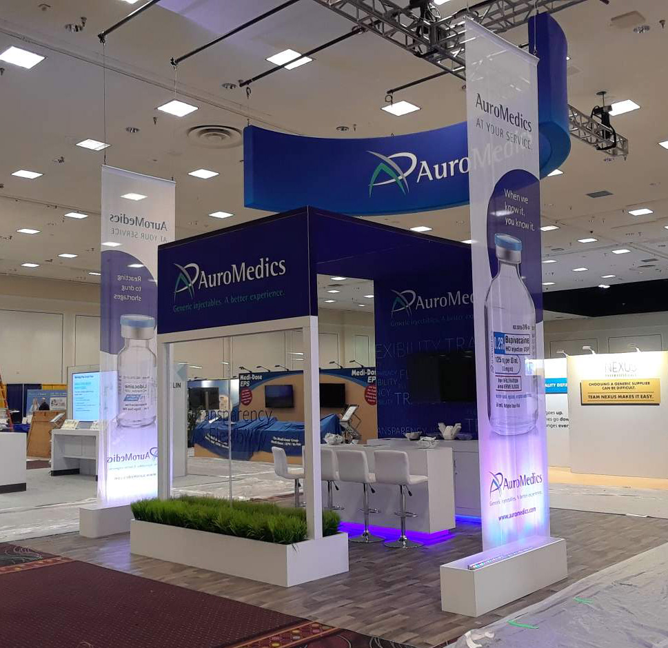
Ashley has been in partnership with AuroMedics since mid-2016. She has diligently been improving their brand image, product portfolio presentation consistency and updating all of their print pieces—corporate catalog, sell sheets, ads, tradeshow booth design, holiday cards—and interactive design—digital banner advertisements, email blasts, social media, and website. In 2016, Ashley and AuroMedics collaborated on the first redesign of their website. The website was rather stark and primarily white with accents of their logo.
2021 Website Redesign
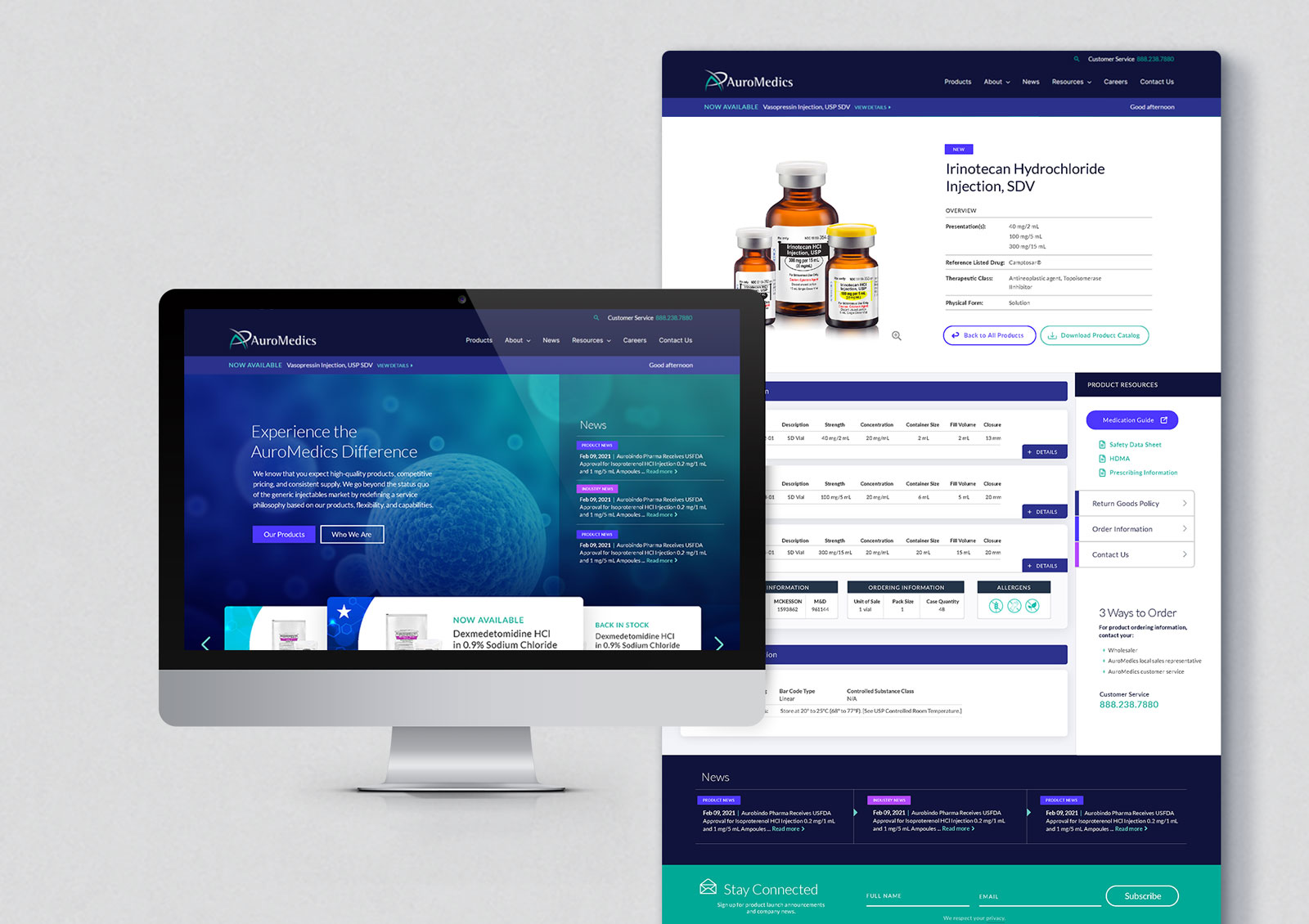
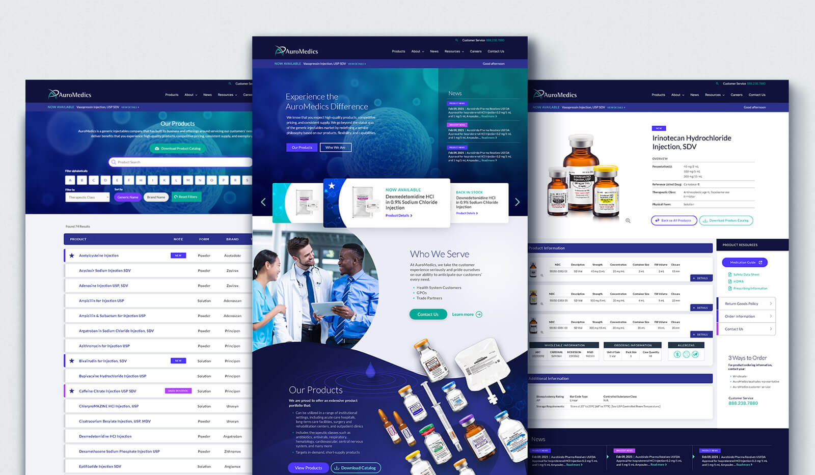
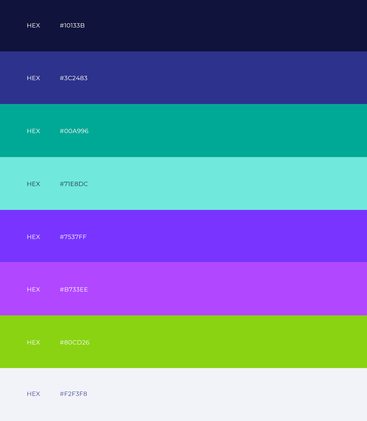
The newest directors of marketing & operations gave Ashley more freedom in the 2021 redesign—updating imagery with higher quality, more saturated and vibrant photography, larger typography, expanding their color palette to give more variety to the brand, adding shadows to create depth, and displaying some of the product graphics at an angle and over an interesting background. The product catalog has been filterable since the 2016 redesign; however, the most recent redesign is much more robust with the ability to filter alphabetically, by therapeutic class, brand name, and product search, all of which are so much more efficient in accessing information. Supporting details such as subtle icons for the product form and vivid product notes such as “Recently Launched” and “Back in Stock” grab the user’s attention.
The user interface is contemporary, streamlined, responsive, and efficient on the front end for both customers and the AuroMedics team. The data on the back-end is an intricate network of product information—categories, filters, allergens, wholesale numbers and DailyMed links, pdfs, and ordering information. The WordPress CMS admin is neatly organized and easy to add posts and product information.
Expanded Color Palette
Consistency in Product Presentation
*label designs are not Ashley's
Digital Web Banners
NPPA 2019 Tradeshow
NPPA Tradeshow Animation on Drug Shortages
Lightbox Panel
