Client
Fusion Ag Solutions – Building for Your Future
History
Fusion Ag Solutions is a family business in Sabetha, Kansas. Their agriculture construction places emphasis on grain system design – new facilities and integration of existing facilities for new equipment, using a 3D site planner. They offer services based on quality, honesty, longetivity, value, and convenience.
Design Inspiration
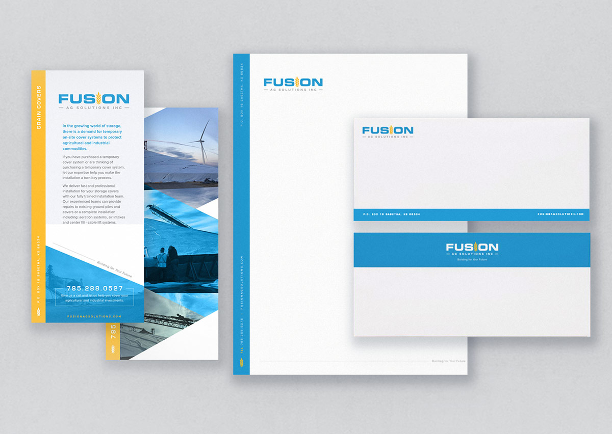
The client requested to keep the logo design modern, strong typographically, yet iconic of agriculture. The brand speaks to both younger and older more traditional generations. The chosen fonts are a mix of traditional Eurostile Bold Extended and a geometric AW Conqueror sans-serif font, reminiscent of Bauhaus and the Art Deco period. The iconic wheat spike is modern, minimal and iconic. The combination of blue and yellow and gray is both corporate and approachable. Floods of color and large typography appears contemporary, while the use of thin lines reflects an older, vintage style.