Iowa School of Beauty
ISB Branding, History, & Design Inspiration
Branded
June 2018
Website
iowaschoolofbeauty.com
Testimonial
 On our old website during the entire month of June, we had 9 leads come in from the website. Now, we average ~20/week! THANK YOU SO MUCH!!!
I sing your praises everywhere I go. So thankful that we found you when we did.
Andrew Oswald
President, Iowa School of Beauty
Client
Iowa School of Beauty
History
Iowa School of Beauty was established almost a century ago (1923) and has been family-owned & operated by the Oswalds since 1973. Their goal is to prepare students for a career they will love, help them grow personally and professionally, and at a fair cost.
Design Inspiration
The new logo is stately and contemporary—resembling high fashion magazine typography with the use of Bodoni. Iowa School of Beauty often goes by its acronym ISB; therefore, the primary logo also needed to have the full name iterated.
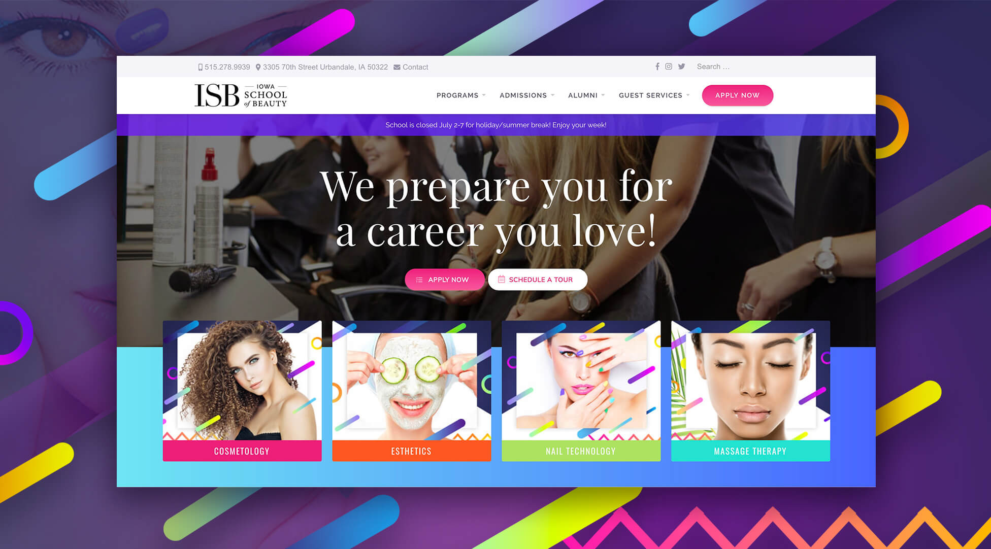
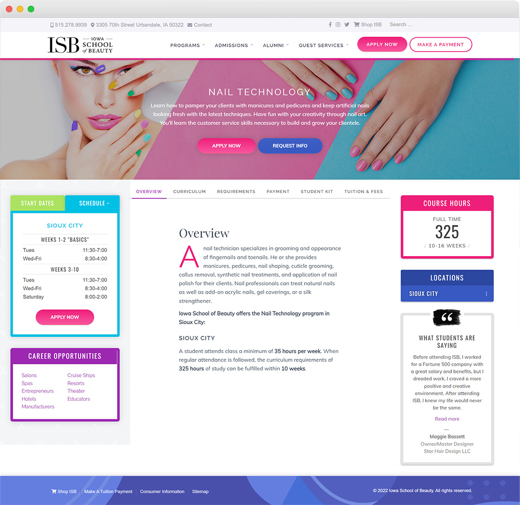
The website is vivid, colorful, and fun with large serif headings (Playfair Display) in contrast with condensed uppercase subheadings (Oswald) and sans-serif body copy (Muli).
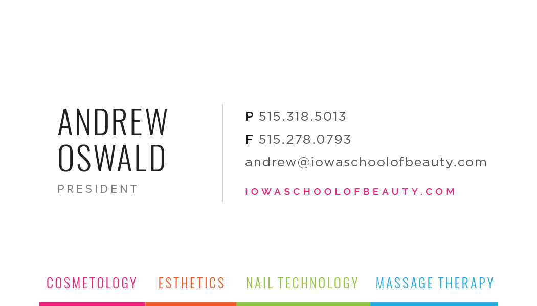
Business Card Design
Business System & Student Application
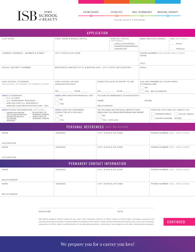
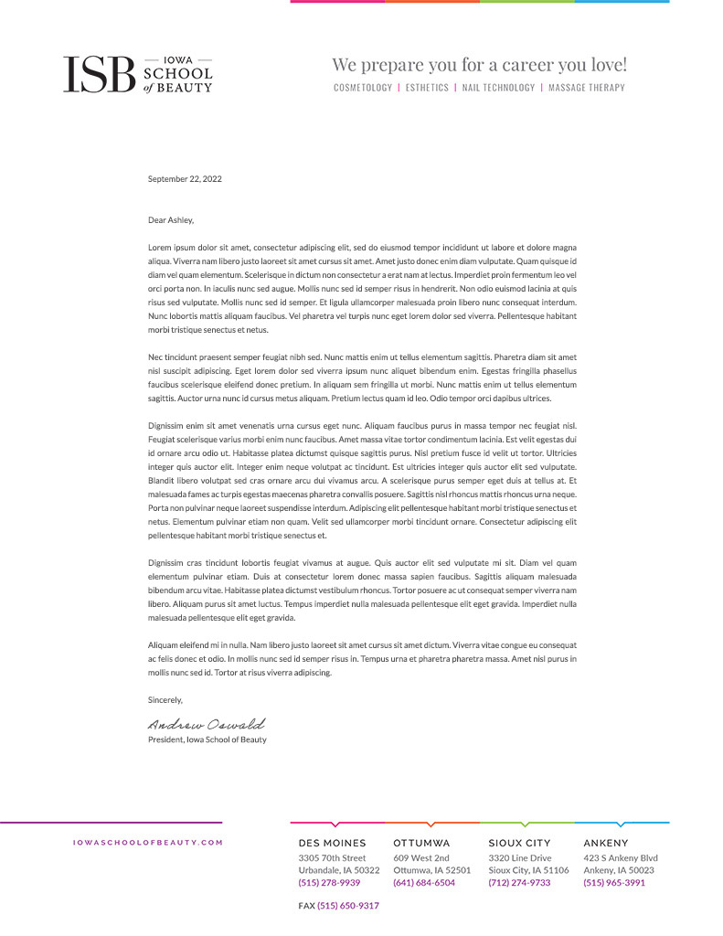
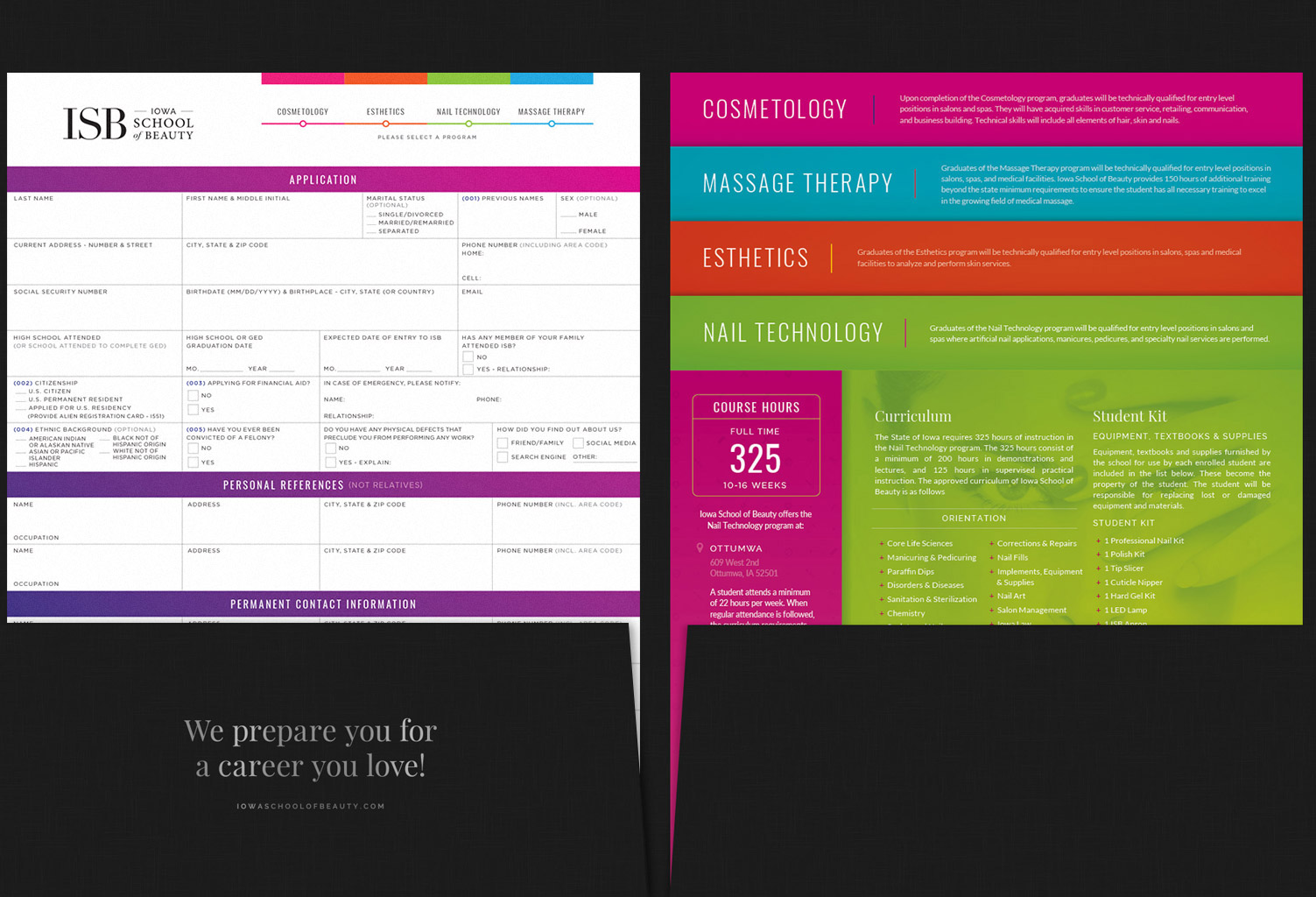
New Student Packet - Folder, Course Inserts & Application Design
Website Goals / Case Study
Brand Story, Goals, & Objectives
Iowa School of Beauty’s tagline is “We prepare you for a career you love!“. Their target audience is high school students with segment audiences being alumni and guest services. Once your business brand story is crystal clear, you have a point of reference to stay on track with your vision, goals, and objectives in the process of building your brand and website. The new homepage is vibrant, fun, and direct about ISB’s goals and program offerings with a concise roadmap and obvious buttons to apply and schedule a tour.
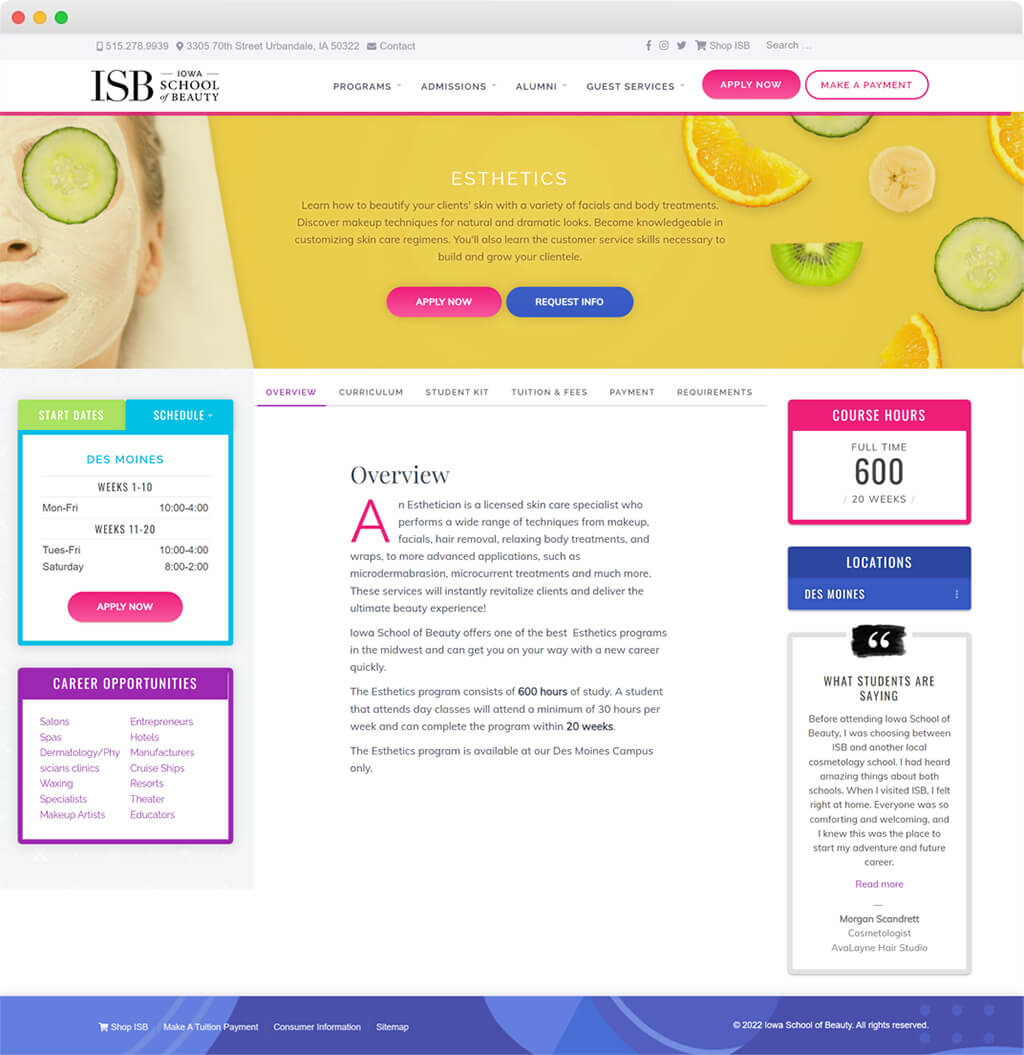
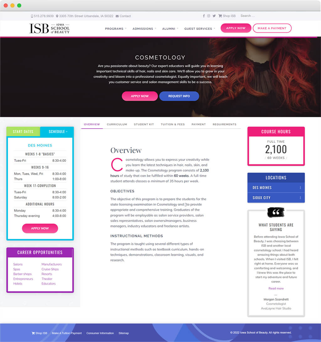
The sitemap of pages was reorganized to improve navigation—grouping relevant pages for each audience segment while the design is more visually exciting than a standard dropdown. The program landing pages are now organized, offering all necessary information—schedules & start dates for each location, all curriculum, student kit, program requirements, and tuition—in an easy-to-use interface.
This was a fun opportunity to get creative with the colors, typography, and imagery. The new site is so much more exciting, easy to use, and mobile responsive. The website has become a lead-generating machine. ISB was receiving about two inquiries per week through the site. After launch and in the first two months, there have been over 175 new applicants and tours scheduled and over 125 contacts and requests for information. Talk about a game changer!
Details such as the greeting in the top right header, which changes based on time of day, make the site friendly and personable.
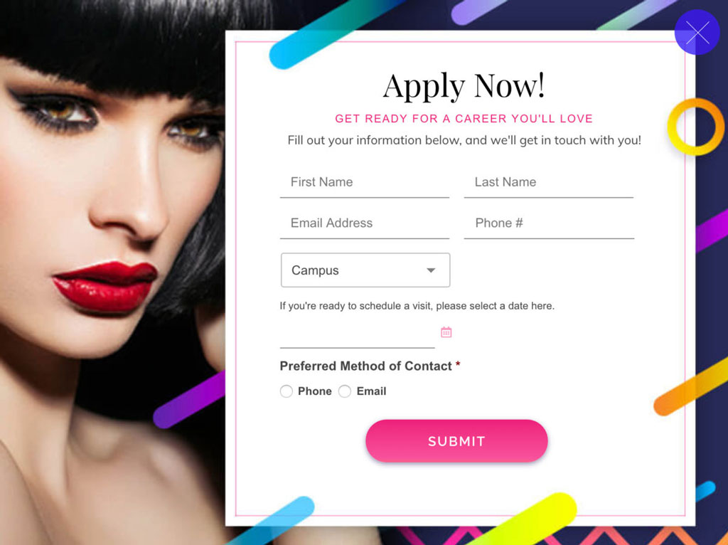
Website Design & Apply Now Pop-up Module
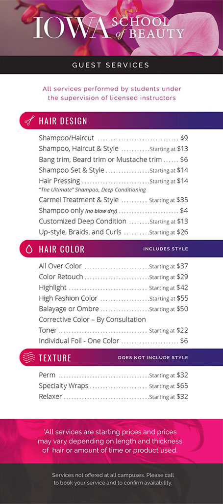
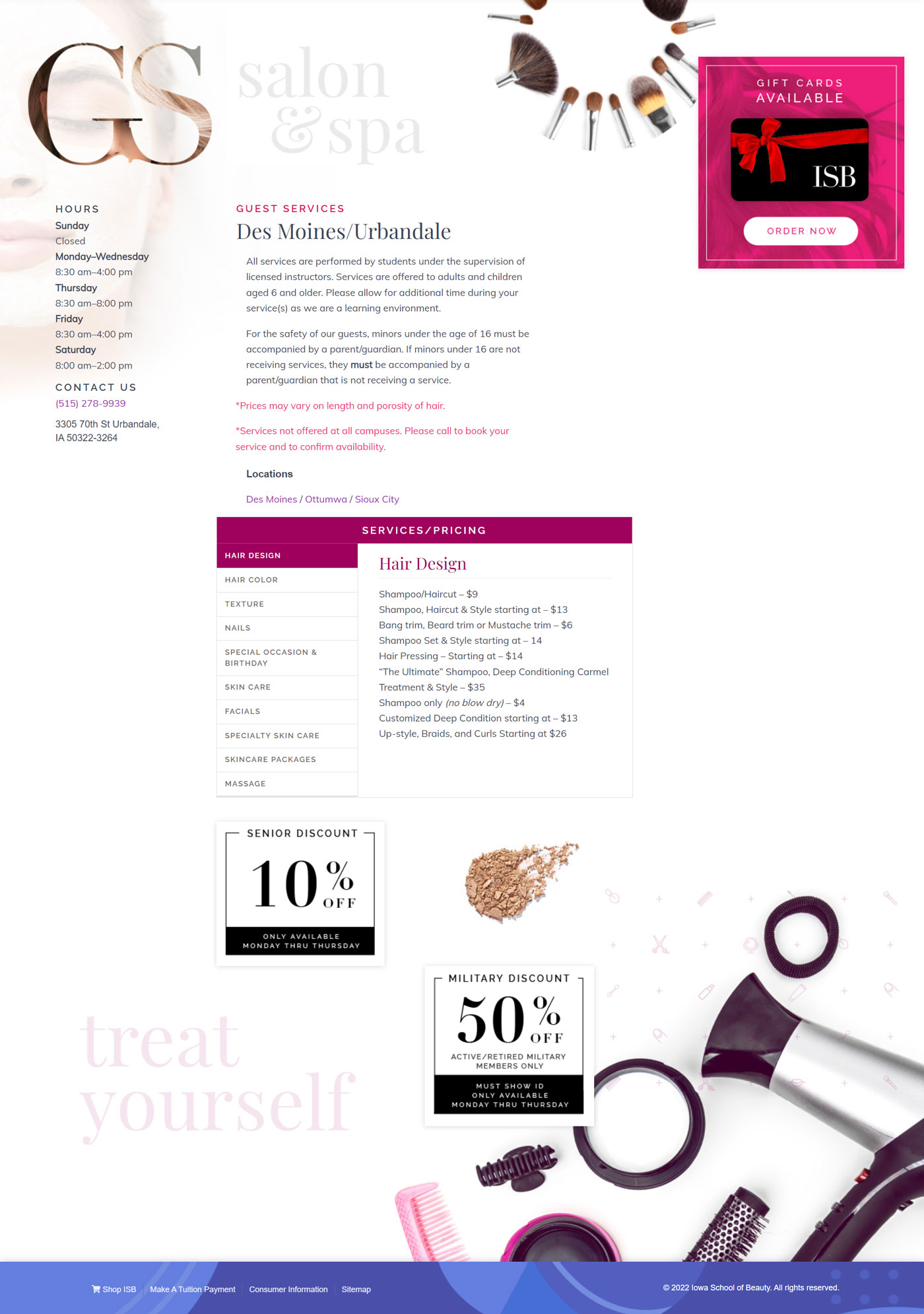
Guest Services Webpage & Brochure
